import numpy as np
import pandas as pd
import matplotlib.pyplot as plt
막대 그래프(Bar Chart)
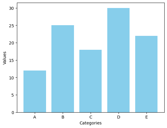
Matplotlib을 활용하여 5개의 카테고리와 각각의 값이 포함된 기본 세로 막대 그래프를 생성하는 코드를 작성하세요.
# 샘플 데이터
categories = ['A', 'B', 'C', 'D', 'E']
values = [12, 25, 18, 30, 22]
plt.bar(categories, values, color = 'skyblue')
plt.xlabel('Categories')
plt.ylabel('Values')
plt.show()
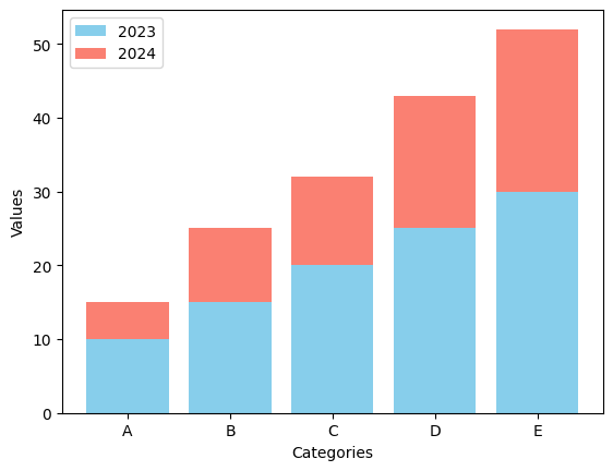
- 누적형 막대 그래프를 생성하여 두 개의 연도별 데이터를 각각 다른 색상으로 누적하여 포현하는 코드를 작성하세요.
# 샘플 데이터
categories = ['A', 'B', 'C', 'D', 'E']
values_2023 = [10, 15, 20, 25, 30]
values_2024 = [5, 10, 12, 18, 22]
plt.bar(categories, values_2023, color = 'skyblue', label = '2023')
plt.bar(categories, values_2024, bottom = values_2023, color = 'salmon', label = '2024')
plt.xlabel('Categories')
plt.ylabel('Values')
plt.legend()
plt.show()
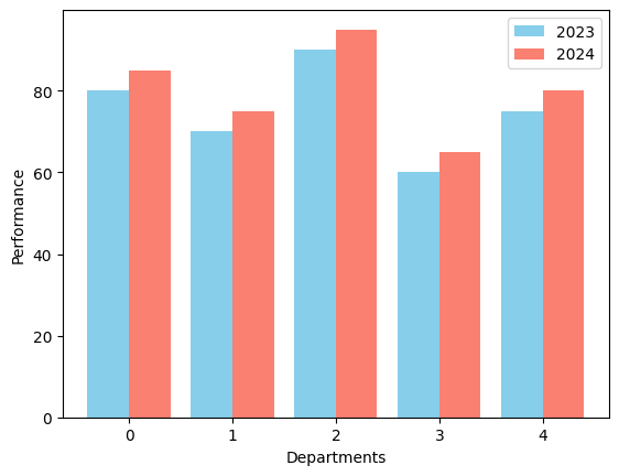
- 한 기업의 부서별 연간 성과(2023년 vs 2024년)를 비교하는 그룹형 막대 그래프를 생성하는 코드를 작성하세요.
# 샘플 데이터
departments = ['Sales', 'Marketing', 'IT', 'HR', 'Finance']
performance_2023 = [80, 70, 90, 60, 75]
performance_2024 = [85, 75, 95, 65, 80]
x = np.arange(len(departments))
width = 0.4
plt.bar(x - width/2, performance_2023, width, label = '2023', color = 'skyblue')
plt.bar(x + width/2, performance_2024, width, label = '2024', color = 'salmon')
plt.xlabel('Departments')
plt.ylabel('Performance')
plt.legend()
<matplotlib.legend.Legend at 0x7e85bdbfa650>
히스토그램(Histogram)
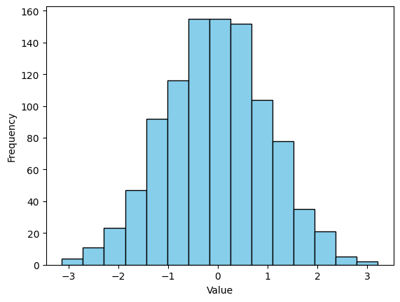
- 정규분포를 따르는 1,000개의 데이터를 생성한 후 구간을 15개로 설정한 히스토그램을 그리는 코드를 작성하세요.
# 샘플 데이터
data = np.random.randn(1000)
plt.hist(data, bins = 15, color = 'skyblue', edgecolor = 'black')
plt.xlabel('Value')
plt.ylabel('Frequency')
plt.show()
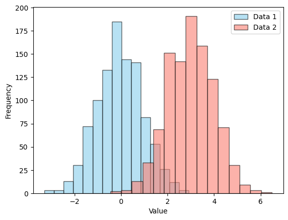
- 두 개의 서로 다른 정규분포를 따르는 데이터셋을 생성한 후 두 히스토그램을 같은 그래프에서 겹쳐서 비교하는 코드를 작성하세요.
# 샘플 데이터
data1 = np.random.randn(1000)
data2 = np.random.randn(1000) + 3
plt.hist(data1, bins = 15, color = 'skyblue', edgecolor = 'black', alpha = 0.6, label = 'Data 1')
plt.hist(data2, bins = 15, color = 'salmon', edgecolor = 'black', alpha = 0.6, label = 'Data 2')
plt.xlabel('Value')
plt.ylabel('Frequency')
plt.legend()
plt.show()
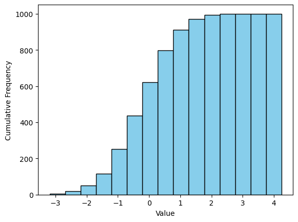
- 한 데이터셋의 누적 히스토그램을 그린 후 X축과 Y축의 적절한 레이블을 설정하는 코드를 작성하세요.
# 샘플 데이터
data = np.random.randn(1000)
plt.hist(data, bins = 15, color = 'skyblue', edgecolor = 'black', cumulative = True)
plt.xlabel('Value')
plt.ylabel('Cumulative Frequency')
plt.show()
산점도(Scatter Plot)
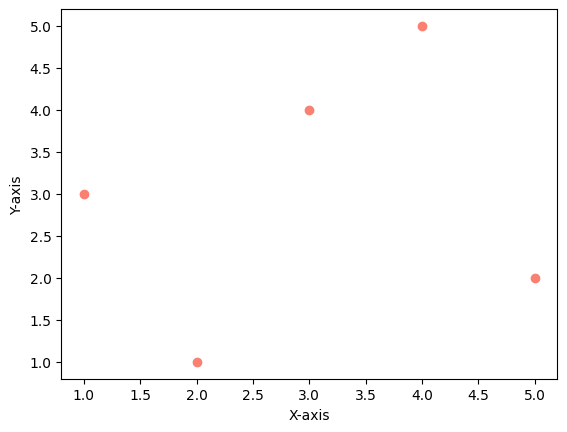
- 두 개의 리스트를 사용하여 산점도를 그리고 X축과 Y축의 라벨을 추가하는 코드를 작성하세요.
# 샘플 데이터
x = [1, 2, 3, 4, 5]
y = [3, 1, 4, 5, 2]
plt.scatter(x, y, color = 'salmon', marker = 'o')
plt.xlabel('X-axis')
plt.ylabel('Y-axis')
plt.show()
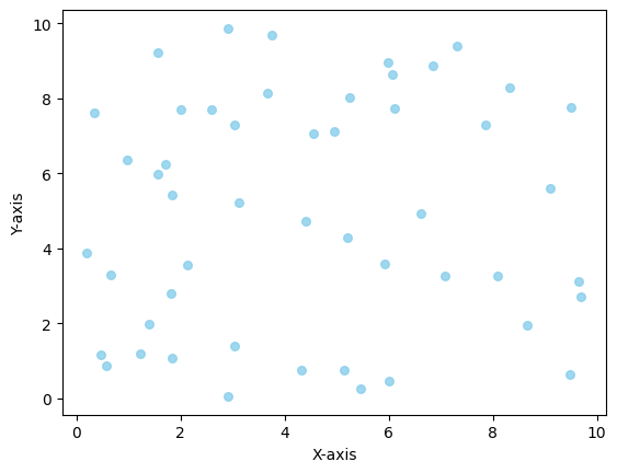
numpy를 활용하여 난수를 생성한 후 산점도를 그리고 점의 색상과 투명도를 설정하는 코드를 작성하세요.
# 샘플 데이터
np.random.seed(42)
x = np.random.rand(50) * 10
y = np.random.rand(50) * 10
plt.scatter(x, y, s = 30, c = 'skyblue', alpha = 0.8)
plt.xlabel('X-axis')
plt.ylabel('Y-axis')
plt.show()
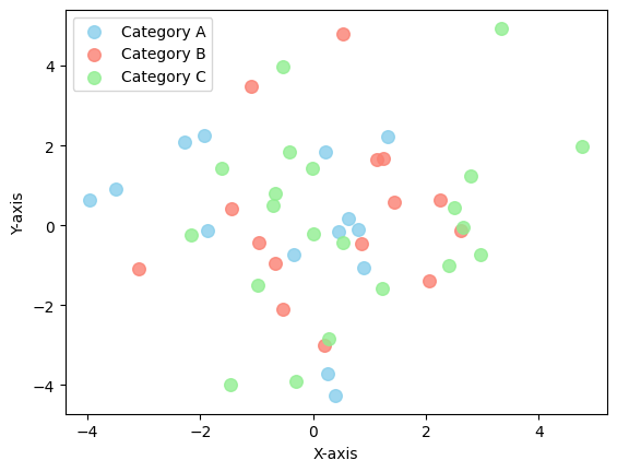
numpy를 활용하여 세 개의 그룹(‘A’, ‘B’, ‘C’)에 속하는 데이터의 산점도를 서로 다른 색상으로 그리는 코드를 작성하세요.
# 샘플 데이터
np.random.seed(10)
x = np.random.randn(50) * 2
y = np.random.randn(50) * 2
categories = np.random.choice(['A', 'B', 'C'], size=50)
colors = {'A' : 'skyblue', 'B' : 'salmon', 'C' : 'lightgreen'}
for cat in np.unique(categories):
  idx = categories == cat
  plt.scatter(x[idx], y[idx], color = colors[cat], label = f'Category {cat}', alpha = 0.8, s = 70)
plt.xlabel('X-axis')
plt.ylabel('Y-axis')
plt.legend()
plt.show()
박스플롯(Box Plot)
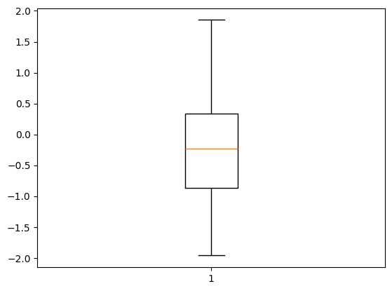
- 평균 0, 표준편차 1을 따르는 정규분포 난수 50개를 생성한 후 해당 데이터를 이용해 기본 박스 플롯을 출력하는 코드를 작성하세요.
# 샘플 데이터
np.random.seed(42)
data = np.random.randn(50)
plt.boxplot(data)
plt.show()
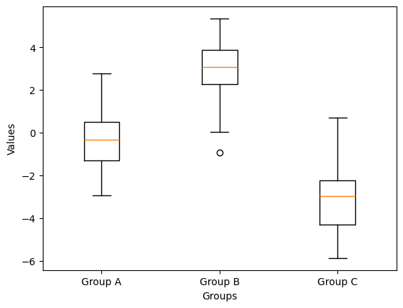
- 세 개의 그룹(Group A, Group B, Group C)에 대해 각각 다른 평균을 가지는 데이터를 생성하고 이를 이용해 다중 박스 플롯을 그리는 코드를 작성하세요.
# 샘플 데이터
np.random.seed(42)
group_a = np.random.randn(50) * 1.5
group_b = np.random.randn(50) * 1.5 + 3
group_c = np.random.randn(50) * 1.5 - 3
plt.boxplot([group_a, group_b, group_c], tick_labels = ['Group A', 'Group B', 'Group C'])

plt.xlabel('Groups')
plt.ylabel('Values')
plt.show()
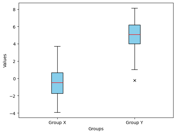
- 평균이 서로 다른 두 개의 그룹(Group X, Group Y)을 비교하는 박스 플롯을 그리세요. 단 이상값을 강조하고 스타일을 커스터마이징해야 합니다.
# 샘플 데이터
np.random.seed(42)
group_x = np.random.randn(50) * 2
group_y = np.random.randn(50) * 2 + 5
plt.boxplot([group_x, group_y], tick_labels=['Group X', 'Group Y'], patch_artist = True,
            boxprops=dict(facecolor='skyblue', color='black'),
            whiskerprops=dict(color='black'),
            medianprops=dict(color='red'),
            flierprops=dict(marker='x', markerfacecolor='red', color='red'))
plt.xlabel('Groups')
plt.ylabel('Values')
plt.show()
고급 다중 그래프(Advanced Multiple Graphs)
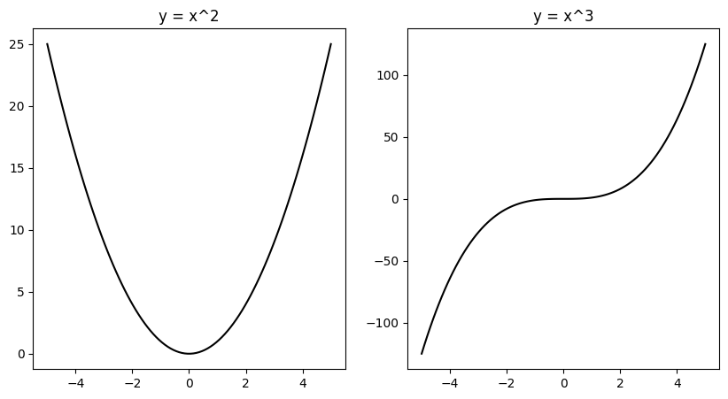
plt.subplots()를 사용하여 2 x 1 형태의 서브플롯을 만들고 첫 번째 서브플롯에는 $y = x^2$ 두 번째 서브플롯에는 $y = x^3$을 그리는 코드를 작성하세요.
# 샘플 데이터
x = np.linspace(-5, 5, 100)
y1 = x ** 2
y2 = x ** 3
f, a = plt.subplots(nrows = 1, ncols = 2, figsize = (10, 5))
a[0].plot(x, y1, color = 'black', label = "x^2")
a[0].set_title("y = x^2")
a[1].plot(x, y2, color = 'black', label = "x^3")
a[1].set_title("y = x^3")
plt.show()
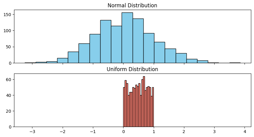
- X축을 공유하는 1행 2열 형태의 서브플롯을 생성하고 첫 번째 서브플롯에는 정규분포를 다르는 난수의 히스토그램, 두 번째 서브플롯에는 균등분포를 따르는 난수의 히스토그램을 그리세요.
# 샘플 데이터
normal_data = np.random.randn(1000)
uniform_data = np.random.rand(1000)
f, a = plt.subplots(nrows = 2, ncols = 1, sharex = True, figsize = (10, 5))
a[0].hist(normal_data, bins = 20, color = 'skyblue', edgecolor = 'black')
a[0].set_title("Normal Distribution")
a[1].hist(uniform_data, bins = 20, color = 'salmon', edgecolor = 'black')
a[1].set_title("Uniform Distribution")
plt.show()
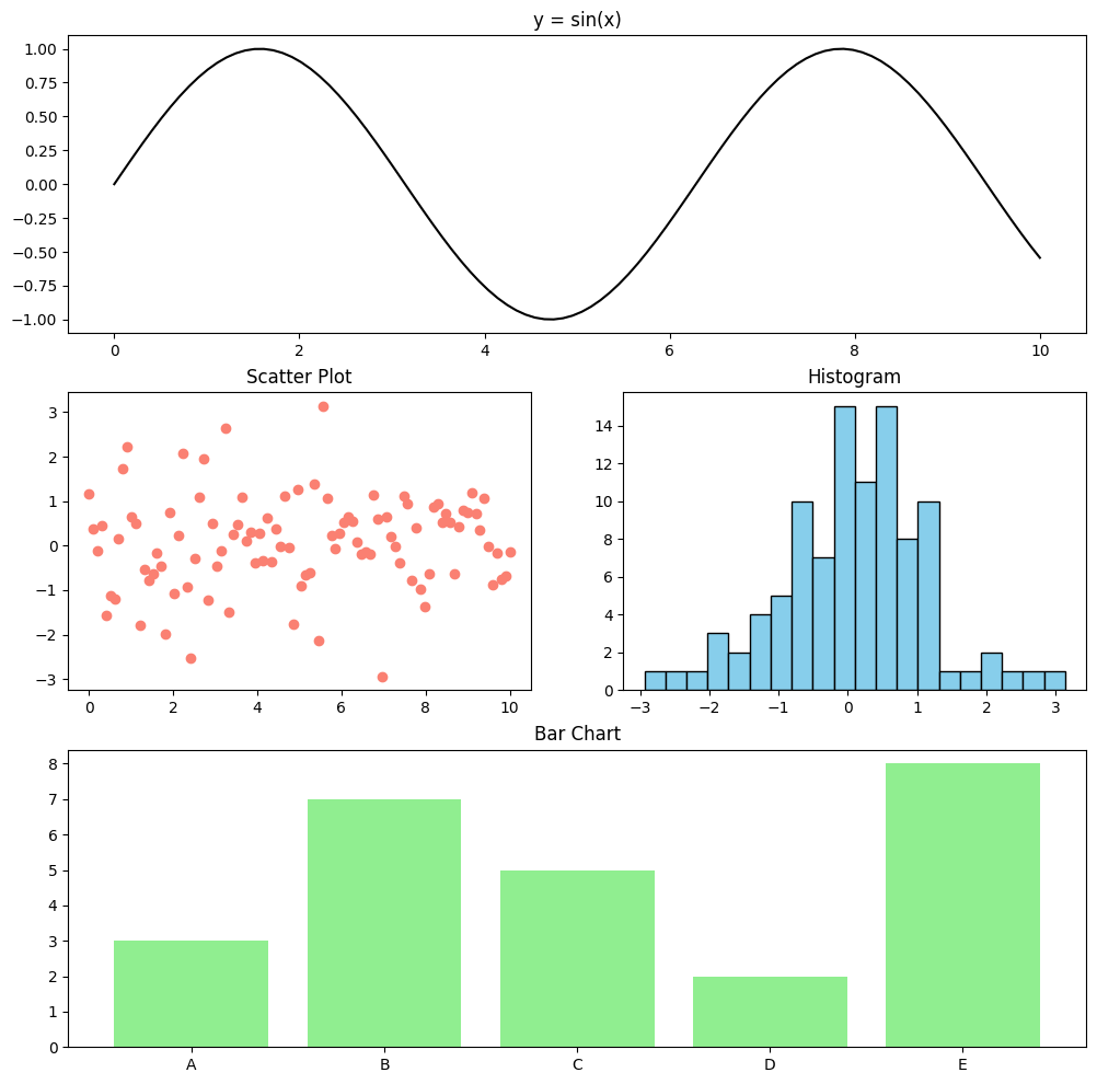
gridspec을 사용하여 불규칙한 레이아웃의 서브플롯을 생성하고 각각 선 그래프, 산점도, 막대 그래프, 히스토그램을 그리세요.
# 샘플 데이터
x = np.linspace(0, 10, 100)
y1 = np.sin(x) # 선
y2 = np.random.randn(100) # 히스토그램, 산점도
categories = ['A', 'B', 'C', 'D', 'E'] # 막대
values = [3, 7, 5, 2, 8]
import matplotlib.gridspec as gridspec
fig = plt.figure(figsize = (12, 12))
gs = gridspec.GridSpec(3, 2, figure = fig)

ax1 = fig.add_subplot(gs[0, :])
ax1.plot(x, y1, color = 'black', label = 'sin(x)')
ax1.set_title('y = sin(x)')

ax2 = fig.add_subplot(gs[1, 0])
ax2.scatter(x, y2, color = 'salmon', label = 'Scatter Plot')
ax2.set_title('Scatter Plot')

ax3 = fig.add_subplot(gs[1, 1])
ax3.hist(y2, bins = 20, color = 'skyblue', edgecolor = 'black')
ax3.set_title('Histogram')

ax4 = fig.add_subplot(gs[2, :])
ax4.bar(categories, values, color = 'lightgreen')
ax4.set_title('Bar Chart')

plt.show()
벤 다이어그램(Venn diagram)
- 두 개의 과일 집합을 정의하고 두 집합의 차집합(한 집합에만 존재하는 요소)을 출력하는 코드를 작성하세요.
# 샘플 데이터
set_A = {"사과", "바나나", "체리", "망고"}
set_B = {"바나나", "망고", "포도", "수박"}
common = [fruit for fruit in set_A if fruit in set_B]

A_only = set_A - set(common)
B_only = set_B - set(common)

print(A_only)
print(B_only)
{'체리', '사과'}
{'수박', '포도'}
- 벤 다이어그램을 그리지 않고 세 개의 집합을 비교하여 각 집합이 단독으로 가지는 요소 개수와 교집합 개수를 계산하는 코드를 작성하세요.
# 샘플 데이터
set_A = {"사과", "바나나", "체리", "망고"}
set_B = {"바나나", "망고", "포도", "수박"}
set_C = {"망고", "수박", "딸기", "오렌지"}
common = [fruit for fruit in set_A if fruit in set_B and fruit in set_C]
common_A_B = [fruit for fruit in set_A if fruit in set_B]
common_A_C = [fruit for fruit in set_A if fruit in set_C]
common_B_C = [fruit for fruit in set_B if fruit in set_C]

A_only = set_A - set(common) - set(common_A_B) - set(common_A_C)
B_only = set_B - set(common) - set(common_A_B) - set(common_B_C)
C_only = set_C - set(common) - set(common_A_C) - set(common_B_C)

print(f"A만 단독으로 있는 요소의 개수: {len(A_only)}")
print(f"B만 단독으로 있는 요소의 개수: {len(B_only)}")
print(f"C만 단독으로 있는 요소의 개수: {len(C_only)}")
print(f"교집합 요소의 개수: {len(common)}")
A만 단독으로 있는 요소의 개수: 2
B만 단독으로 있는 요소의 개수: 1
C만 단독으로 있는 요소의 개수: 2
교집합 요소의 개수: 1
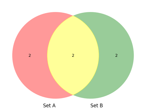
- 벤 다이어그램을 그리면서 특정 조건을 만족하는 경우 색상을 다르게 지정하는 코드를 작성하세요.</br>
조건 : 두 개의 집합을 비교할 때, 교집합이 2개 이상이면 노란색 그렇지 않으면 기본 색상을 사용하세요.
# 샘플 데이터
set_A = {"사과", "바나나", "체리", "망고"}
set_B = {"바나나", "망고", "포도", "수박"}
from matplotlib_venn import venn2

venn = venn2([set_A, set_B], set_labels=('Set A', 'Set B'))

common = [fruit for fruit in set_A if fruit in set_B]

if len(common) >= 2:
  venn.get_patch_by_id('11').set_color('yellow')

plt.show()